From The Wall Street Journal:
‘Color is my day-long obsession, joy and torment,” Monet once lamented, while Georgia O’Keeffe noted, “I found I could say things with colors that I couldn’t say in any other way—things that I had no words for.” Decades later, Steve Jobs sounded a different note, saying, regarding Apple’s candy-colored iMacs, “For most consumers, color is more important than megahertz, gigabytes, and other gibberish associated with buying a typical PC.”
Such is the poetry and the power of color. Color pervades our lives, and yet we probably think little about its many facets, which also include theory, history, utility and mystery.
. . . .
All of those aspects are on view at the Cooper Hewitt, Smithsonian Design Museum, in “Saturated: The Allure and Science of Color,” which explores how we perceive and use color. As visitors climb a staircase to the exhibit—which is drawn from printed materials that belong to the Smithsonian Libraries and design objects that belong to the Cooper Hewitt—they should grasp with a glance the first principle, that color is simply light in different wave lengths, via “Peony” (2014), designed by Karel Martens. As light cast by the chandelier above changes shades, so too does the appearance of this wall hanging, with colors shifting in intensity. Digitally printed, “Peony” consists of thousands of multicolored pixels, imprinted with differing designs and arranged by an algorithm to form the flower.
“Saturated” then takes visitors through “seven phases of color”—a reference to the seven hues Aristotle cited in his color spectrum in the fourth century B.C.
. . . .
Color’s mysterious properties, like iridescence, fluorescence and optical illusions, are still being explored and exploited. As Josef Albers wrote in his seminal book, “Interaction of Color” (1963)—a copy of which is on view—“In order to use color effectively it is necessary to recognize that color deceives continually.” The exhibition offers such examples as a Tiffany Peacock Vase (c. 1901) and a 19th-century Indian fabric woven with beetle wing casings for iridescence, as well as 21st-century Nike running shoes in fluorescent green.
Link to the rest at The Wall Street Journal
Indie authors are confronted by color decisions when they choose covers for their books. Most of those covers will, of course, be viewed through a computer monitor against the white background of Amazon.
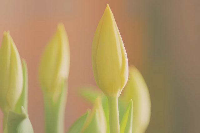
Here’s a photo PG took a few weeks ago that he enjoyed for its quiet colors.

Nice image, Mr. PG!
For those Indies who want to learn a design secret about colors, especially on covers, here’s a little article I wrote about it a while back:
https://www.goodreads.com/topic/show/13245444-a-touch-of-grey
> a design secret
There’s no secret. There’s yellow, blue, and mudcolor. Just like a rainbow. The rest are imaginary.
I used to think it was just me, until I tried to get help tagging wires in a fuel injection harness. Three different people couldn’t agree on which colors were which when it came down to picking one of the half-dozen colors used. All of them swore they had perfect color vision, then got angry when someone else didn’t agree…
I wound up using a test light on connector pin.
Such a peaceful photo! It’s much appreciated tonight.
Oh, that’s a lovely photo. So soothing! Which is a great complement from me, considering I’m usually attracted to deeply saturated colors, jewel tones, and basically have the same color taste as a five-year-old! For instance, I’m getting ready to redo a kitchen with an iridescent tile back splash. Not for the faint of heart.
I adore your photos, PG. Thanks so much for sharing them on your blog. This one is lovely, as usual! 😀
Thanks for the kind words, J.