
Indie authors are advised not to attempt too creative with their fonts in manuscripts destined to become ebooks. Given the limited font support in the variety of ebook readers, tablets, ebook apps, etc., the results can be unfriendly to a good reading experience.
However, fonts used on ebook covers, websites and in social media promoting an author’s books are a different story. In those media, right or wrong fonts can have a big impact.
From Typewolf:
.
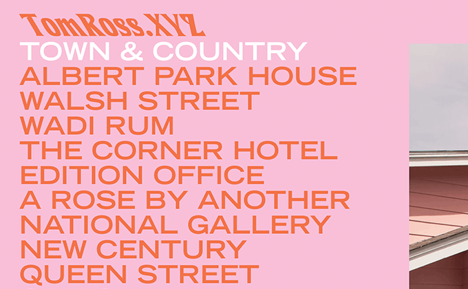
Tom Ross
This site is more type-focused than your typical photographer’s portfolio which helps to set the mood before the visitor actually explores any of the photos. The logo is set in Introspect, a hippie-esque font that was popular in the 1970s—it’s actually the same font used in the Albertsons grocery store logo, but here it’s artificially skewed to the left in a reverse italic style which makes it less recognizable. Extended cuts of fonts have been trending lately, but we usually see neo-grotesques used like Helvetica Neue and Nimbus Sans. So seeing something from the gothic genre, like Trade Gothic used here, is a bit different.
. . . .
.
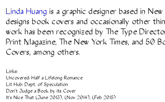
Linda Huang
Linda Huang has an amazingly good collection of book covers in her portfolio which shows type being used in all kinds of clever and creative ways. The font used on her site, The Stroke Sans, is unique as well. It draws on similar calligraphic influences as Frauen, the font I used for my own personal portfolio, but combines that style with a “computer-generated” pen stroke. Notice the unusual connecting strokes on the letters w and M. It’s definitely a distinctive font, however, the kerning looks to be a little off—notice the gaps in the words graphic and covers in the above screenshot.
Link to the rest at Typewolf