From AWWWARDS:
In the world of web design we have been experiencing a long process of incorporating typography effects in sites, which years ago was technically impossible, or at least could only be supported by a few browsers. Luckily this situation has changed and we are now enjoying an explosion of creativity in the use of web typography and communication, whilst still maintaining high levels of accessibility. The last few months have seen an increase in the richness of typefaces, decoration styles and hover effects, while icons and emojis are emphasizing the expressiveness of texts even more.
Hero fonts and bold typefaces
The use of bold typefaces is a trend that gives personality to texts and is overtaking images as the main design element. The creative use of typography is taking centre stage and, to a large extent, overtaking hero images and videos – which are multimedia elements that can have less than favorable effects on mobile browsing.
Serifs ARE BACK
Serifs are anything but new, nevertheless, they have clawed their way back to the forefront enough that they are no longer seen as belonging to the past: bold + serif = 2018. So, polish up that amazing Clarendon, you’re gonna need it!
. . . .
Hero fonts and large letter sizes in paragraphs
The texts on a website serve more of a purpose than a purely visual one, they are a way of expressing the personality of a product whilst forming part of the “Voice and Tone” of the communication. Right now we are incorporating all the visual resources we can get our hands on including icons, emojis, pictograms, audio and overlaid images. The copy now commands so much respect that paragraphs feature as principle elements, sometimes even appearing as big as the titles.
. . . .
Pictograms, icons and emojis decorate our paragraphs
There are many typical (and not so typical) ways of text decoration that can coexist in the same paragraph, such as the classical underlines and italics of different weights to express or reinforce ideas. All this, together with numerous and peculiar hovers, colorful underlined blocks, outlined fonts, changes in typography, switching between serif and san serif (even in the same sentence), pictograms, icons and emojis are now scattered through the texts for decorative and semantic purposes. The desired outcome – to make the text more dynamic. The combinations are endless, many of them the result of visual experiments of Brutalism and Maximalism in web design.
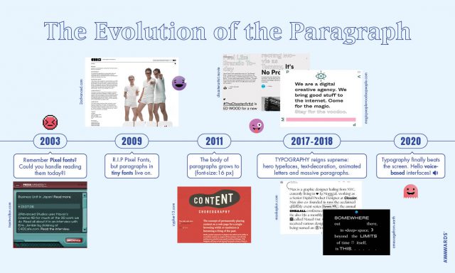
The evolution of the paragraph in web design
The size of fonts and length of paragraphs have been growing at such an increasing speed over the last few months, so we could not resist making the following graphic to illustrate the evolution of paragraphs in the history of web design.
(Click on the image below for a larger version)
.

Link to the rest at AWWWARDS
My unfavorite is the voice-based interface. Does that mean I have to speak aloud to navigate, thus annoying everyone around me in the dentist’s waiting room (where I spend much too much time)?
Or do they mean yammering websites? I wonder if it occurs to these designers that I, and presumably many other noise-phobic people, keep the sound off when we web-surf.
Anybody remember Form Follows Function?
Heh, I had an HP running 98 with an actual ‘volume control’ knob on the keyboard that would fill in a bar at the bottom of the screen when you turned it. I had headphones plugged into it because I didn’t need to bother others the few times I was listening to things.
Imagine my surprise when going to certain sites when that volume bar would suddenly flash to ‘100% volume’ – the sites were sending the code to crank up the sound!
And they wonder why I always have some way to kill their noise …
> increase in the richness of typefaces, decoration styles and hover effects,
—
translation: “more goat-gagger page cruft to drive up the data usage of the poor schmucks who have to pay by the megabyte.”
also, “page carefully tuned to work ONLY with one or two specific web browsers, (a skilled webslinger can tweak Firefox or Chrome to be platform-specific as well!) and will die horribly on anything else.”
“numerous and peculiar hovers, colorful underlined blocks, outlined fonts, changes in typography, switching between serif and san serif (even in the same sentence), pictograms, icons and emojis are now scattered through the texts for decorative and semantic purpose”
All I can think of is the mad rush when the web was young to have multiple colors, blinking fonts (remember the much hated blink tag?) and every new effect as it was created.
Every time some hot new flashy trick becomes possible everyone dives into the deep end and over uses it until we become sick of it and long for simple clean text that delivers a coherent message rather than tricks and fluff.
Downloaded fonts. Pages that had so many fonts they looked like ransom notes.
alt.flash.die.die.die…
If they get too crazy trying to look special I have to close the page – and whatever message they were trying to get across …