
From Kindle Direct Publishing:
PG stumbled on something he hadn’t seen before on KDP, A+Content capabilities.
Basically, this appears to be a new tool to allow you to perk up your indie book descriptions with breakthrough formatting such as Bold, images, images with text overlays and stuff your fourth-grade relative has been doing in html since three months after she/he was born.
However, instead of using sophisticated html creation programs, you have to use a clunky-looking set of tools that the bosses at KDP have ordered their underlings to create.
In addition, the Zon has special content guidelines that appear to be different than the usual KDP book description content guidelines.
To wit:
Before you create A+ Content, review the A+ Content Guidelines. Amazon has specific terms and policies regarding types of content that may not be allowed, so review these carefully. Violating these guidelines may lead to a rejection by our system, which can require updates.
Just because KDP has a marketplace where you’re promoting your books now doesn’t mean that it will support A+ Content.
A+ Content must be created and published in each marketplace where you would like it displayed. From kdp.amazon.com, you can publish A+ Content in these marketplaces:
- Amazon.com
- Amazon.ca
- Amazon.com.mx
- Amazon.com.br
- Amazon.co.uk
- Amazon.de
- Amazon.fr
- Amazon.es
- Amazon.in
- Amazon.it
- Amazon.nl
- Amazon.com.au
- From kdp.amazon.co.jp you can publish A+ Content in Amazon.co.jp
The languages that A+ Content can be published in vary by marketplace.
And, finally, the book description police have upped their game as well.
All content in compliance with our A+ Content Guidelines will appear on your detail page within eight business days. If your content requires changes, we’ll send you an email with further instructions.
For PG, this feels like going back to Web Design 1.0 again. You can check out Content Examples of A+ Content to see what the A+ people think is cool online merchandising.
Link to the rest at Kindle Direct Publishing
PG has speculated before that Amazon’s KDP tech and management people live in a world of their own that is apart from the mothership tech and design group. For Amazon’s other product lines, there are lots and lots of ways of presenting information, formatting marketing messages, putting up images, etc., etc.
You can even create your own branded store – here’s a link to one for Cuero, a leather-goods company PG hadn’t heard of before stumbling on it when he was looking for an example of a visually-interesting store on Zon.
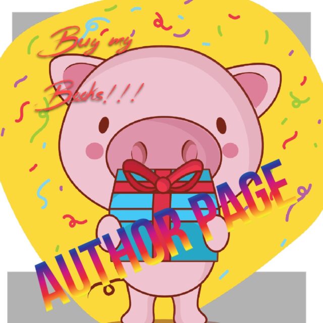
For some reason books and authors seem to get the brown shoe set of marketing design tools. For example, if you look at JK Rowling’s author page, you’ll see that it looks pretty much like Rosie Graveltruck’s author page. Aside from her family, Rosie has not made any sales on Amazon. JK has been a money machine for both her publisher and the Zon. Cuero is way cooler than JK is.
PG just used a free app he found online while creating this post – PIXLR – to create an Author Page graphic that is far more eye-catching than Amazon can manage for JK.
Cuero has a seller account. It’s different than an author/KDP account, so what is offered is different.
A+ content rocks though. That goes on an individual book page (near the middle), not the author page. When it first became available for authors, I did it myself, but I’m not a graphic artist, so I did it as simply as I could. BookBrush now has templates though, so as soon as I have time, I’m going to redo mine.
Not quite understanding PG’s gripe. The A+ content now allows us Indies to add graphics to the Product Page that only the Trads could do before (I believe). And I’m doing it! This is a good thing.
The Author’s Page is something separate. It covers the basics in a perfectly obvious way: headshot, bio, list of books, updates, etc.
I don’t see a problem here.
Hey Harald, it’s been a while. To make sure I understand what’s on offer here, I went to one of your books at random (Neander). Its page does look like Danielle Steele’s (Affair), which I chose to test against since she’s tradpub. Are you referring to what I’m calling the “marketing graphic”? The one on your page says “The final volume! Can Tom save his family?” Steele’s graphic says “A riveting novel about difficult blah blah blah…”
If so, then this does level the playing field as far as punching up the product pages. Your indie page “blends in.” I notice the indies in the “recommended books” feature on Neander’s page don’t have those graphics yet. I also don’t know if the presence or absence of the marketing art makes a difference, but it can’t hurt, and it does look more professional. In PG’s example an author included a graphical timeline; such a thing can come in handy for readers of a given story universe who are trying to figure out a good entry point. This seems like a useful feature.
Well, Jamie, this is the first time I’ve been compared to Danielle Steel (with 1 billion books sold)! But yes, it’s the graphic box that now comes under the heading: From the Publisher. And if you go to one of the other books in that same NEANDER series, you’ll see another box I added (am waiting for more reviews on the latest one before adding that to the book you looked at).
And yes, I think including this A+ graphic adds to the overall professional appearance of the offering. I see very little reason not to do it.
I’ve had A+content for several books since October or so last year and I haven’t noticed any difference in sales because of it. When I’ve asked other authors they have the same experience. Have any authors on The Passive Voice seen a difference in sales?
Alec, I don’t know if you’re ever going to succeed in tracking sales to this one feature, but I do think it adds “juice” to the product page.