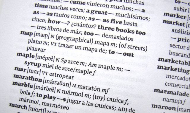
From TypeTogether:
Book-making has not become any easier, even with centuries of progress since Gutenberg’s 42-line Bible. New technologies have made the process faster but no less challenging. From typesetting to binding, every single step requires the eye of a conceptual artist, the keen attention to detail of an editor, and years of practice to perfect. In the realm of type design, making a great type family for books is as complex as it gets.
Great book fonts do not scream, draw attention to themselves, or require a multitude of styles to be useful. Since their task is to relay content while creating an enjoyable reading environment, any spectacular and eye-catching lettershapes are more of a hindrance than an advantage in these settings. Text typefaces rely on controlled contrast, pleasant proportions, even texture, and thoughtfully cohesive text setting. Add to these requirements the most subtle sense of personality, and a typeface will have the ability to influence the reader by pleasing the eye and engaging their receptive mind.
. . . .
Sirba
Sirba is a friendly, low-contrast serif that’s warm and even in complex settings. It was designed for use in demanding environments such as dictionaries, academic texts, annual reports, novels, and magazines. As such, Sirba includes a full set of IPA symbols for phonetic pronunciation and coverage for Greek and Cyrillic scripts.
Sirba has a classic touch revealed by its beauty in such design details as the asymmetrical bottom serifs, curved bracketing, and terminals with calligraphic undertones. Because of its open counters, large x-height, and short ascenders and descenders, it provides a pleasant reading experience and high legibility even in texts of demanding scope. Furthermore, annual reports and tables benefit from the low cap height and consistent width of the tabular numerals between the weights. With font weights from sparse to stark, Sirba can handle many levels of hierarchy and text differentiation in books.

Link to the rest at TypeTogether
TypeTogether provides examples of a variety of different Book Fonts that it licenses/sells.
PG acknowledges that he sometimes has difficulty discerning the details that differentiate fonts from the written description of those fonts. For example, he’s not certain he can distinguish between fonts with pleasant portions from fonts without pleasant proportions. He is certain he will not be able to identify a font that’s “warm and even in complex settings” from one which is not. He hopes that he’ll know it when he sees it.
PG notes that fonts used in ebooks may not display in the same manner on various ebook reading devices. He suspects that in many cases Serif and Sans-serif will be the font choices offered for ebook consumption.