From Lapham’s Quarterly:
Color is among the most challenging aspects of our experience to describe. Spectrophotometers and colorimeters can quantify light waves, yet their measurements have little impact on our feeling for color. As the philosopher Zeno Vendler put it, “Vincent van Gogh loved the color yellow—and certainly not because of its wavelength.” Color is infamous for its variability in language and perception. How can we know that what we are seeing is the same as what someone else sees? How can we separate what we are seeing from the thing itself? Or, as Ludwig Wittgenstein asked in his Remarks on Colour, “Where do we draw the line here between logic and experience?” In the Remarks, written the year before his death in 1951, the philosopher’s thoughts about color invariably lead back to the study of philosophy. What things are knowable? How are they known? What can be determined through philosophical reasoning? Wittgenstein reflected, “Colors are a stimulus to philosophizing.”
Color can reveal the variety of experience in a way that few other subjects can. Vision, whether described in language or represented in paintings or film or virtual reality, is the quotidian version of locked-in syndrome. In literature and poetry, the personal nature of color perception often serves as a metaphor for other sweeping failures of communication. In everyday conversations, those stumbling, destabilizing references to a blue sweater (it’s actually black) or a green car (it’s blue, in fact) are both forgettable and earth-shattering. For some philosophers, the experience of color is most similar to that of pain: an internal state that resists quantification. But who wouldn’t rather philosophize about azure instead of aches and pains?
In the Remarks, Wittgenstein briefly considered color in photography, though he was quick to note that his example was “not a color photograph.” For someone born in 1889, color photography was still an exception to the rule. Wittgenstein describes but does not name an image of a scene in a machine shop. In it, he saw “a man with dark hair and a boy with slicked-back blond hair standing in front of a kind of lathe, which is made in part of castings painted black.” “What does it mean,” he asks, “that hair looks blond in a photograph?” He identifies several types of metal in the shop—the painted castings, galvanized wire, iron, and zinc, which all seem truthfully represented by shades of gray in the photograph. But the blond hair confounds him: “How does it come out that it looks this way as opposed to our simply concluding that this is its color?” Wittgenstein seems to immediately perceive color in the black-and-white photograph, rather than logically deducing that the light-toned hair must be blond.
For Wittgenstein’s younger readers, color photography was fast becoming the norm. A 1956 color film booklet enthused: “The lifelike beauty, the realism, the high-fidelity color quality that you get with your camera and Anscochrome Film will give you endless satisfaction. For you will not only record but actually reproduce and re-create the original beauty and sparkle of the subject in the finest form for future enjoyment.” As color photographic processes proliferated so, too, did boosters’ praise for them. The most common descriptors were “natural” or “lifelike,” despite the obvious differences in color rendition between film stocks. Kodachrome appears blocky to contemporary viewers, offering a limited dynamic range and low contrast. Fujifilm is known for its vivid greens. Polaroid instant color prints can seem milky and unsharp. All were touted as “natural.”
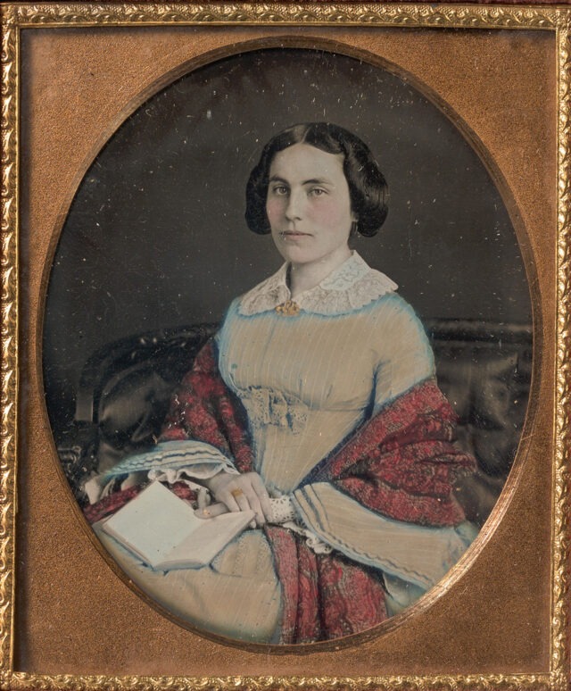
Photographers’ studios have added color to photographs by hand since the medium’s earliest days. Three of the first five U.S. patents related to photography described methods to add color to the monochrome process. Painters employed by photography studios added everything from a subtle blush tint to the lips and cheeks or dabs of gold to jewelry to create radically overpainted images. While the public apparently clamored for colored photographs, critics were unconvinced. Their most common charge was that by painting over the image, less skilled photographers could cover up their errors—and the truth of the original photograph.

In comparison, mechanical color processes promised to amplify photography’s authenticity. They did not rely on the artist’s hand to add color after the fact. Some mechanical color processes, such as the French Autochrome, were available to professionals in the early twentieth century. But color photography became a widespread possibility only in the mid-1930s with the invention of Kodachrome film, first made available for 16 mm motion pictures in 1935 and for 35 mm still cameras the following year. Technicolor film stock was introduced in 1932. It was critically praised in 1939’s The Wizard of Oz, which used the transition from black-and-white to color film to dramatize the shift from Dorothy’s reality in Kansas to the fantastical world of Oz. Technicolor, with its vibrant, highly saturated colors, was celebrated as better than the real thing.
Kodachrome and other films designed for the still photography market instead claimed faithfulness to reality. One very early instruction manual promised that “the introduction of Kodachrome has placed in the hands of the nonprofessional user a color medium which will reproduce color with almost perfect fidelity.” A spate of how-to books accompanied the new technology, offering instructions on everything from exposure and printing to “how to see color.” These included warnings about using “color for color’s sake” or including so many colorful elements in the frame that it became, in one Kodak editor’s words, “a veritable ‘color hash.’ ” Another author cautioned against making a very specific, but apparently ubiquitous, picture: “We are not particularly interested in a beautiful girl clad in a brilliant red bathing suit playing with an equally brilliant blue, yellow, and green beachball.”
Professional photographers remained skeptical of color film. In instructional guides, they qualified the manufacturers’ claims about natural color. A photographer for the American Museum of Natural History explained in 1941 that Kodachrome “has no subjective reactions. What it sees is not colored by previous knowledge or experience. When the color film sees grass, it doesn’t insist, as we are so apt to, that all grass is green. It may see brown grass or blue grass or other colors that look all wrong to us in the processed film.” Notable photographers, including Berenice Abbott and Louis Stettner, also took care to point out that humans and film “see” color differently. Abbott suggested that some of the difference lay in our past experiences: “When we judge the color photograph, we not only think of how the subject looked in nature, but we also remember how painters throughout the centuries have rendered similar objects. The color photograph has to satisfy a double standard—fidelity to real life and a recognizable approximation to traditional art.” These caveats beg the question: Which color is natural? What we’ve trained ourselves to see or what is out there in the world?
By the 1960s color film dominated the amateur market as well as the movies. Color negative film became available for Kodak’s easy-to-use Instamatic camera in 1963; Polaroid debuted instant color prints the same year. Snapshots in color offered a broad swath of viewers some of their first apparently objective experiences of light, uninfluenced by the brain’s adjustments. The new film, which was initially color balanced for daylight, could not make the perceptual changes that we do when we see objects in different types of light. We think of an apple as being the same color whether we look at it on a tree or on display in a grocery store. When asked to draw an apple, a child will seldom stop to inquire where that apple appears: Indoors or out? Under warm or cool light? But, as physicists will eagerly tell you, color is merely the product of reflected light. An apple doesn’t possess the color red; it reflects red wavelengths while absorbing others. We see the reflected light. But which colors are reflected is also determined by which colors are present in the light. Film prepared to respond to the color temperature of bright sunlight (6500 Kelvin) makes the lower temperatures of incandescent lights appear orange, while fluorescent bulbs render the scene markedly green. An apple is never simply red.
. . . .
Although the changing colors of sunlight had been amplified by Impressionist painters of the late nineteenth century—think of Monet’s snowy haystacks in periwinkle dawn or the Aperol orange of his Rouen Cathedral at sunset—these strange visions now began appearing in amateur snapshots. A 1962 Kodak manual recommended the warm tones of sunset and sunrise for dramatic landscapes but cautioned that they were inappropriate for portraits. The reddish light would render the family like a pot of “boiled lobsters,” according to the author, evidently thinking only of the effect on light skin tones. Similarly, the popular how-to author Fred Bond wrote of photographing during those forbidden hours, “If flesh tones appear badly ‘sunburned,’ do not blame Kodachrome. It recorded what it saw.” During this period color film privileged not only bright, white sunlight but also white skin. Kodak film labs and at-home printers used a company-provided color chart that featured a photograph of a white model, designating white skin as “normal.” Owing to the limited tonal range of color film at the time, when photographers exposed and developed for the light end of the spectrum, darker tones fell into shadow, leaving no detail or tonal gradations.
. . . .
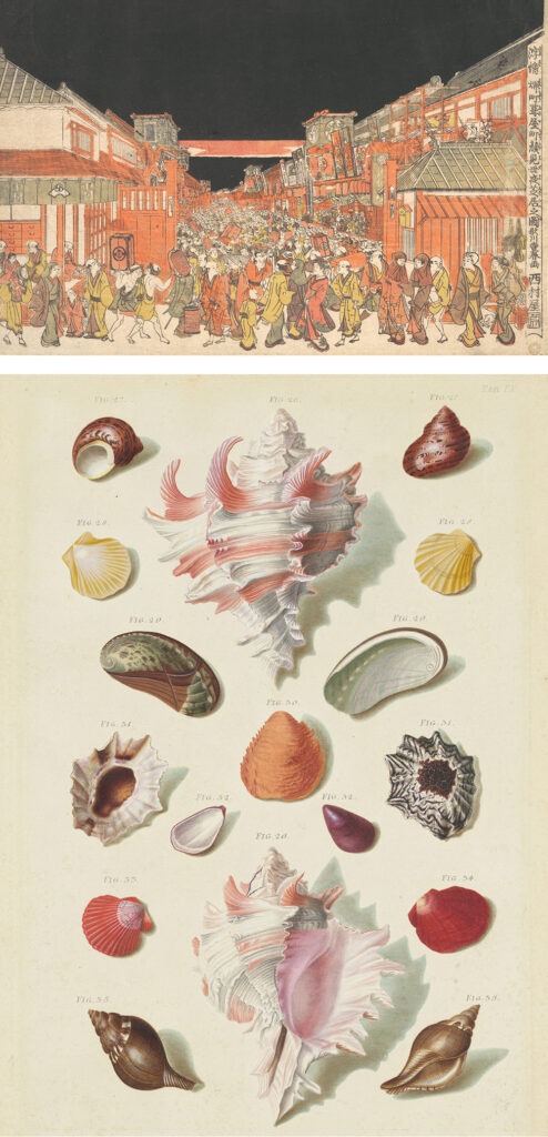
Long before the invention of photography, natural scientists, artists, and craftspeople had struggled to communicate about color. Although Japanese artists had been creating multicolor woodblock prints since the mid-eighteenth century, printing in the West largely relied on a secondary process of hand coloring until the rise of chromolithography in the late nineteenth century. Some disciplines, such as heraldry, established notational systems to specify color in monochromatic prints. Engravers used different styles of hash marks to indicate the colors used in coats of arms. Sometimes engravings and woodblock prints were colored by teams of colorists before their sale, but others were colored by their owners, according to their own preferences or interpretations.

Link to the rest at Lapham’s Quarterly
PG notes that any photographer who takes more than a handful of photos has had the experience of being disappointed because the colors in the photo are not those the photographer saw when she/he pressed the shutter button.
PG couldn’t resist linking to Paul Simon’s Kodachrome.
I taught for many years, most of them in majority Black schools. I would often take digital pictures, to show lab experiments of demos.
I quickly learned that, when a White student was present in the picture, I would have to adjust the photo, to avoid either Black students being unrecognizable, or the White student being a ghostly color. It took a few tries before I got good at it.