
From Fast Company:
Dark patterns are user interface elements that are intentionally designed to trick or confuse users. They can do anything from nudge users to hand over their data to encourage them to spend another $5 to play more Candy Crush. Dark patterns serve companies, rather than their users, for an array of opaque reasons the average person will never recognize. But thus far, there’s been nothing to incentivize companies to cut back on dark patterns aside from consumer outrage.
Senators Mark Warner (D-VA) and Deb Fischer (R-NE) presented a bill this morning, according to CNBC, that would tighten the reins on big web platform holders with “over 100 million active users,” like Google, Facebook, and Amazon. Such modern monopolies are each guilty of leveraging dark patterns at one time or another. Dubbed, “The Deceptive Experiences to Online Users Reduction Act,” Axios says that the bill would make it illegal for companies to “design, modify, or manipulate a user interface with the purpose or substantial effect of obscuring, subverting, or impairing user autonomy, decision making, or choice to obtain consent or user data.” On top of that, it would ban UI design that creates “compulsive usage” in users under 13, and bans various forms of data analysis on young users (for instance, Facebook has been criticized for being able to ad-target teens when they felt “insecure”). Furthermore, companies would have to share data experiments publicly.
Link to the rest at Fast Company
PG did a bit of research and found the following:
UI design gets dark sometimes. Particularly when companies exploit their user interface to trick users into doing something they wouldn’t consciously do, usually for profit. Sounds improbable? If only! Companies often use so-called ‘dark patterns’ to baffle users.
. . . .
Basically, dark patterns are UI tactics that encourage the user to take a path they didn’t mean to take. These patterns take the principles of good UX and UI design, and turn them on their head. In dark UX, color theory is manipulated to misdirect, language is used to confuse rather than clarify, and the user is exploited to boost company reach or profits.
. . . .
See that bit above where we talk about company profits? That’s why dark patterns are so ubiquitous. Companies are often looking for short-term results, and increases in numbers rather than qualitative stats like ‘user happiness’. And dark patterns work, in that sense; they successfully trick people, so companies keep using them.
But consistent use of tricksy UI patterns and dark UX is in fact damaging to the company in the long-term. Users don’t like being hoodwinked, and will call dark patterns out on social media (witness the #darkpattern hashtag on Twitter).
Plus dark patterns stop working after a while and companies have to think of something else. Why not design good user experiences that keep users coming back for more, instead of UI patterns designed to trick?
“Any short-term gains a company gets from a dark pattern are lost in the long term,” Hoa Loranger, NN Group
So, here are 5 common UX dark patterns and some user-friendly alternatives.
1. Deliberate Misdirection
Anyone who’s ever booked a budget flight online will be familiar with this dark pattern classic. Take the example of airline Ryanair. Users are directed to buy travel insurance, but on clicking the dropdown menu they see a list of Countries of Residence. The opt-out for purchasing travel insurance is way down the list, under the unintuitive listing ‘No travel insurance required’.
. . . .
The darkness lies in the fact that the pattern is misdirecting you — you think you’re picking travel insurance, but then suddenly you’re telling them your country of residence, and it doesn’t look like deselecting travel insurance is an option. Unless you skim down the list and spot it there, formatted to look identical to the countries of residence.
. . . .
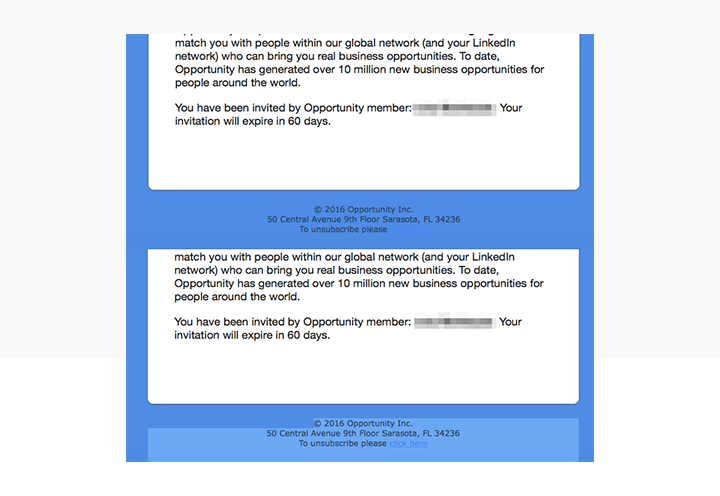
2. Invisible Unsubscribe
A user’s inbox is their personal space. Users guard access to that space pretty vigilantly, and the ability to unsubscribe from a mailing list is a key part of that. Most companies and email service providers make unsubscribing simple. But some prefer dark patterns instead.
Check out this example, where the unsubscribe button is formatted to be… invisible
. . . .
3. Growth Hacking Through Spamming
No one likes email spam. But even worse than getting spam is finding out that you yourself are the unwitting spammer. This can happen when apps or services you join ask for access to your email contacts — they make out like they just want to help you find friends already using the same service, but in reality they want to spam all your contacts with invitations to join up. Classic dark pattern.
Take the well-documented example of LinkedIn, which was exposed by blogger Dan Schlosser in a much-read Medium post. The professional networking platform asked Dan to strengthen his network; that actually meant ‘send 1000s of emails to contacts not on LinkedIn with one click’. Worst part? The emails purported to be from Dan himself, not LinkedIn. In 2015, LinkedIn lost a lawsuit about the pattern to the tune of $13 million USD.
Link to the rest at UX Planet
PG’s first response to the above was that it was definitely a first-world problem and he suspects it will be ridiculously simple for the dark forces behind dark patterns to avoid punishment under any law passed by the United States Senate.
PG’s operative practice online is to never trust any online organization with anything important until the organization demonstrates its honesty and reliability. He doesn’t order goods or services from anyone who appeared online yesterday. He doesn’t give information until he’s satisfied the organization is not run by crooks or crazy people and he provides information limited to what he thinks is reasonable even after he’s satisfied.
If he’s asked for more than he believes is reasonable, PG has no hesitation about providing fictitious information. He can live in Texas and Florida and Bermuda at the same time if he doesn’t think the organization asking really needs that sort of information to provide whatever PG wants from the website.
A couple of specific tips:
Many credit card issuers are happy to issue a virtual credit card number to an individual who has one of their cards. Virtual card numbers can only be used online and for phone purchases. You can cancel the virtual number without adversely impacting your ability to use the real number or to obtain a new virtual number. Some people PG knows who spend a lot of money online simply cancel their virtual credit card numbers every 30-60 days as free insurance from the hassles of disputing charges that appear on their card statements.
See Credit Card Insider for more information.
Email addresses are free. You can have as many as you want and stop using any address that starts getting spammed or is otherwise used by someone who annoys you. It is pretty easy for PG to select people who he wants to stay in touch with. If PG has given an organization a temporary email address, but later decides he wants to stay connected with the company, he can always give them his permanent email address.
One way of managing temporary email addresses is to use the date when you created the address or the date you want it to expire – August2019Gone@gmail.com could work. (Actually not for you – PG just signed up for that address because he didn’t want to inadvertently include someone else’s working GMail account in this post.)
PG prefers a separate email program to web-based email. In past lives, he has used Outlook, but in recent years, he has moved everything to Thunderbird – a free open-source email program from Mozilla.
With the practice PG has had, it’s ridiculously simple for him to set up a new email box on Thunderbird. If he receives an annoying email, he right-clicks on the address and can send future emails from that address directly to Trash. With about the same effort, he can mark it as Junk with similar results. If he’s finished with a temporary email address, he just deletes that mailbox on Thunderbird and is not exactly certain what happens to the emails sent to that address thereafter. He doesn’t really care so long as they don’t consume a single cycle of a single brain cell.
Since TPV has always included a large proportion of highly-intelligent and well-informed visitors, PG is certain some of the comments will include far better ideas than he has discussed.
The biggest problem with reading novels is it’s addictive. Something must be done. Authors purposely write to pull the reader in and keep him reading hour after hour. School kids can’t stay awake in class because they have been reading in bed with a flashlight. That’s how they make money.
Books ending in cliff hangers, and series of books should be included in this legislation. All they are designed for is to pull the witless into another book, and feed their addiction.
Hmm, that would kill off +90% of the phone apps as they all want more data on you than they need to do what they claim they do for you. (I seem to remember hearing that some ‘games’ want permission to use your mic, camera and GPS data?)
No doubt they’ll leave loopholes for their own uses as well as their friends.
Like that Do-Not-Call list that just happened to excluded charities and political spam calls.
@ Elizabeth
They aren’t interested in stopping that at all – and if they did it would kill 99% of advertising as the ad companies will do whatever it takes to get you to watch the ad and hopefully by the product.
“ban UI design that creates “compulsive usage” in users under 13” Wouldn’t that describe every video & PC game ever written? (Or, at least, the successful ones?) YouTube? Netflix?
For that matter, remember that a UI (“user interface”) is not a concept limited to websites and computer programs. If a user interacts with it, it has a user interface. A successful user interface can be anything that does not get in the way of the intended users. So add anything that under-13 years olds can be induced to use compulsively: toys, cell phones, cable TV, vending machines, spectator sports, public libraries (we wish!), …
I remember reading that many game companies hire psychologists to make their games as addictive as possible. I can’t find the original article, but this always seemed immoral to me.
A game that isn’t addictive isn’t worth buying.
They do. My BF is convinced that Candy Crush hired psych to help them put together the game to optimize dopamine response. The dopamine rush is one of the things that hooks you.IF you get the pacing just right, you can hook people very effectively.
Lynda.com has a course that covers dark patterns – but I can`t remember the name or the instructor.