
From Written Word Media:
In this post, we’ll outline the five most common mistakes in book cover design and how to avoid them. These tips can help you whether you are creating you own cover with a program like Canva, or working with a designer. When you work with a cover designer, keep these tips in mind and make sure you give them creative direction that won’t force them to make the mistakes below.
1. Too many elements on the cover
This is an all too common mistake, particularly with inexperienced designers. It’s common to feel the need to fit multiple elements of your plot on the cover to give it a more descriptive feel. It’s also common to see covers with all main characters depicted to give readers a better idea of what they look like.
Here are the big problems with overloading a cover with story elements:
- It’s confusing, the reader isn’t going to know which element is most important.
- Book covers are shown as rows of tiny thumbnail images on most retail sites like Amazon. There simply isn’t enough space on that tiny thumbnail to communicate much.
- As a rule of thumb, one beautiful element that tells part of the story is almost always better than lots of small elements.
The desire to have a cover describe a book comes from a good place of care for the reader. But, unfortunately, such book covers will likely only be appreciated by readers after they have read the work. Without context, a mish-mash of elements can seem overwhelming and can turn a reader off.
Take a look at the example cover below. The style is in the Cozy Mystery vein, but it has tried to put every aspect of the plot on the cover. Yes, it’s interesting to imagine how the author will weave all of these objects together, but that requires a lot of thought.
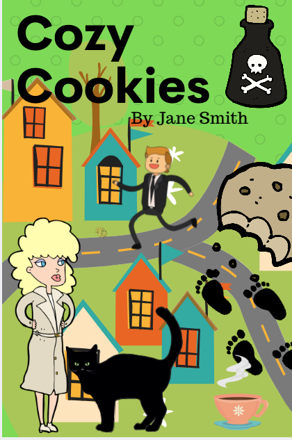
A reader is making split second decisions about which book to buy. At first thought, this cover is confusing and overwhelming. A well-designed cover will draw a reader’s interest right away, not after studying it like a famous painting.
This cover also doesn’t utilize blank space, which is an extremely powerful design concept. Inexperienced designers will often shy away from leaving any space unused on a cover. But, in reality, having well placed blank space draws attention even more to key elements. If you notice your cover designer has left blank space on your cover, resist the urge to tell them to fill the space with stuff.
A great example of picking few elements and using blank space is Joanne Fluke’s cover for “Banana Cream Pie Murder.”
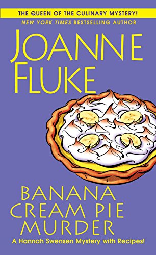
This cover leaves some room to breath in the middle, which draws the eye to the few main visual elements. It is easy for a reader to see and understand everything on this cover with a quick glance.
Many book cover designers will ask you to fill out a form with information about what you the author want on the cover, make sure to give them the feedback that you don’t want too many elements.
Link to the rest at Written Word Media