
From Book Riot:
AIGA (The American Institute of Graphic Arts) annually announces the 50 best book covers of the previous year, as chosen by a panel of judges. They “evaluate each work’s integrated design approach, including concept, innovation and visual elements such as typography, illustration, and/or information design.”
Link to the rest at Book Riot
Here are a few that caught PG’s eye:
There are videos at the link that show a lot of creativity going on inside the books as well.
You can see them all the AIGA Winners Page
Hey, we’re talking art here, not something grubby like commerce!
Those were the winners? Not a single cover would induce me to click. I also must have missed the memo that covers should be all text now.
In theory “all text” could be a good idea as both title and author should be easily legible on the thumbnail – in practice they even managed to screw this up. I guess that they – and the judges – were thinking this was an artictic project, when they needed to be emulate old time marketing pros putting out advertising flyers.
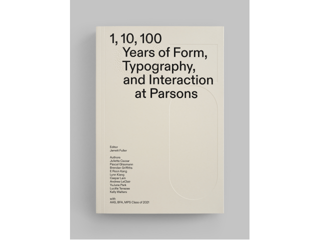
This one is (almost) all text but it works, I think.
https://www.amazon.com/End-World-Just-Beginning-Globalization-ebook/dp/B09C65JNPF/ref=sr_1_1?crid=36L693G3BNKA8&keywords=peter+zeihan+end+of+the+world&qid=1656710544&sprefix=zeiha%2Caps%2C751&sr=8-1
Hits 4 rules head on: non-fiction, readable sub-title, intriguing title, and the cover hints at competence at presentation. (Your milleage may varied.)
I agree (though I think that non fiction is probably a bit easier as the title – and subtitle – can convey the “what it’s about/genre” message more easily than for fiction, and this one certainly succeeds).
Seems a bit like a fashion show. A bunch of stuff nobody will buy.
No. 1 — The book cover should shout what genre it is in.
No. 2 — The author & title should be easily legible at thumbnail size.
No. 3 — Books in a series should seem like they belong together.
No. 4 — The quality of the cover should suggest quality content.
No. 5 — There should be enough information & appeal to encourage the potential reader to look further.
Almost all of these fail at these fundamental tasks.
The most wonderful product in an indecipherable wrapper will not get bought.
I’m tempted to say you are just stating the obvious, but it clearly needs saying as it appears to be anything but obvious to the professionals employed by traditional publishers and, in particular, the opinion leaders who rule what is good and bad and give out the prizes.
And if they cannot accept such basic rules, how much do they know of the techniques required to achieve compliance? No 2 mostly comes down to choice of font and close attention to the contrast between text and background colour, basic craft rather than artistry, but a quick look over cover images on Amazon shows how often they fail at this fundamental level.
Hear! Hear!
Wow. Most of them I wouldn’t even click on to see what they’re about. Why do so many have titles you can’t read? Isn’t the whole point of the cover to grab your attention and get you to click on it?
The OP heading tells you why: the covers were selected by graphic designers, not authors, much less shoppers. “Look how clever we are!”
Too true.