
From Ingram Spark:
Believe it or not, there is a science behind choosing the best fonts for books. Think about all the places you see type today. Whether it’s a phone, a computer screen, a book, an ad, a magazine or a menu, almost every minute of the day is spent reading something. And—other than the menu at your favorite restaurant perhaps—much thought has gone into which font to use.
Generally speaking, there are two main reasons for caring about the best fonts for books, or for anything that will be read. They are:
- Readability
- Being “on message.”
In the following paragraphs, we’ll explore each of these reasons, plus the best fonts for books, both for body text and headings. Then we’ll talk about where to buy fonts if you are formatting the book yourself.
. . . .
Factors that determine the readability of a typeface include the spacing between letters, the height and thickness of letters, and the size of the serifs.
Serif fonts help with readability, and are therefore preferable in the body of a book. The “serif” is the decorative stroke that finishes each end of a letter (think Times Roman). Serif fonts are easier on the reader’s eye than sans-serif fonts; the stroke leads the reader’s eye from one letter to the next. Serifs help pull the text together, making it easier for the eye to move and recognize one letter to another, helping the eye to speed through long passages of text.
As the name “sans serif” indicates, these are fonts without the decorative flourish (think Helvetica or Arial). Reading a line of text printed in sans serif is more tiring. For this reason, sans-serif fonts should be reserved for headings or other limited uses. Yet, how many books have you seen with a sans-serif font in the main body because the author preferred it that way?
. . . .
What message is your book trying to send? What do you want the reader to feel?
In addition to being readable, the author wants the text to look inviting and welcoming. Depending on the book’s genre and topic, there may be other messages, such as mysterious, romantic, cheerful, transformative, business-like and more.
For both print and digital books, the typeface is part of the message. Book designers will study a manuscript to get a feel for the tone of the writing before choosing a text font. The right text font for a book can complement the author’s message. If it’s a good fit, the reader probably won’t even notice; the reading will feel easy and just “flow.” In contrast, the wrong choice of typeface can feel jarring.
Imagine a book meant to evoke the reader’s emotions, and the body text is Helvetica! Talk about cold! The reader will sense that the message is wrong, and probably won’t even know why. These are the reasons why companies spend so much money on getting print ads “just right,” ensuring that they are sending the message that will encourage consumers to buy.
. . . .
We polled our book designers, and one of the top choices for the body of a book is the friendly and warm “Caslon.”
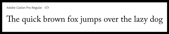
Caslon refers to a family of fonts first designed in 1722 by William Caslon I, an English type engraver. It was used extensively by the British Empire and throughout the American colonies, and was in fact used to set the Declaration of Independence! Caslon continues to be one of the most popular fonts today, with multiple offshoots, versions and interpretations. When used in body text, this font conveys an inviting and readable feeling. It gives a feeling of a human touch, with warmth and familiarity. Caslon is a good choice not just for historical novels, but also anytime a solid and dependable feeling is desired.
Link to the rest at Ingram Spark
Can’t get enough of Minipax (https://www.fontsquirrel.com/fonts/minipax) as a screen font these days. I don’t know if I’d publish a book using it, but it sets screens on fire for me– easy to read, but edgy, stimulating. Minipax is associated with George Orwell, for those with polemical souls. And it’s free.
Sure enough, I use ACP (Adobe Caslon Pro) for the interior text of my (paperback-version) historical novels. But I went through a process to pick it: I printed dummy book portions with 6-8 body text fonts before making my final decision.
But there’s one problem with ACP for me: the Italics are a bit fancy, and the Question Mark is awful. So I replace that character with Adobe Garamond Pro. Search-and-replace, baby.
It’s Monday. Therefore it’s time for another round in the Font Wars, which bear a startling resemblance to the Albigensian Crusade… especially when anyone attempts to specifically identify the righteous instead of merely describe the righteous, over the wide range of materials that people choose to “publish.”
With all due respect to the “book designers” at Ingram Spark, one wonders if they’re paid endorsers in their stated preference for Caslon (and Adobe Caslon in particular) as a default. Caslon (and Adobe Caslon) are probably fine for the most plain-vanilla of applications: few headings (because Caslon’s letterspacing clashes horribly with the four most-popular families of sans serif fonts), few numerals, almost entirely paragraphed running text with US-keyboard characters, no footnotes or other significant changes in font sizes, line length of approximately 30–35 words in a single column, audience doesn’t have any visual impairments (age-related or otherwise) whatsoever. That is, it’s fine for novels that don’t have character names or place locations with diacritical marks. Which is, admittedly, the primary market of Ingram Spark.
Having been a technical editor for academic materials published in a wide variety of other formats, Adobe Caslon (and Caslon in general) is not in my ordinary toolkit for those works (I specifically redesigned two academic journals for other font families and got a lot of compliments for the improved readability, especially for foreign-language, tabular, and noted material). And the less said about both Caslon and Times New Roman’s designed-in unsuitability for legal materials, the better!
This is one of the biggest beefs I have with the received wisdom of graphic and book designers (and, for that matter, those who specify what fonts are default/supported on e-reading devices and software): The assumption that all books are well-served by pretending that the default is reprints of The Mill on the Floss. Yeah, that works really well for cookbooks…