
From The Book Designer:
If someone asks you to name some popular young adult fiction writers today, you’d probably mention authors like John Green, Cassandra Clare, J.K. Rowling, and maybe even Louisa May Alcott. But back in the day, S.E. Hinton, author of The Outsiders, was—and still is, in my opinion—one of the best YA fiction authors around, known for her novels set in Oklahoma, where she was born.
Hinton attended Will Rogers High School and graduated in 1966. While still a student, she wrote her first (and most popular) book, The Outsiders, which was published in 1967. The coming-of-age novel revolves around the Greasers, a group of working-class boys, and their rivalry with the wealthier Socs (Socials). The protagonist, Ponyboy Curtis, is a Greaser who struggles with societal expectations and class conflicts.
Because this novel explores evergreen themes of friendship, loyalty, identity, and the impact of social class on individuals, especially teens, it has become a classic among readers who are reminded of the prejudicial systems that existed in their own schools and neighborhoods. In 1983, the novel was adapted into a movie starring Tom Cruise, Ralph Macchio, and Patric Swayze.
It’s been nearly six decades since The Outsiders was first published, and there have been many reprints and book cover designs since then. In this article, we’ll cover the various The Outsiders book covers that have been released.
The Outsider’s Paperback Covers
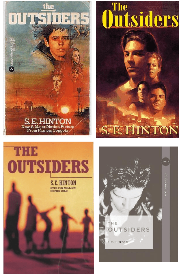
The paperback covers for The Outsiders are some of my favorite covers because they all depict the central theme of the novel: youth. The first three follow a similar concept: bright and dull orange hues, the landscape of a small town, and young (school)boys taking center stage. While you might not guess that the story is set in a school, you’ll know almost instantly that the plot revolves around teenagers or young adults trying to navigate life in their town.
The colors of the first three covers themselves are striking to the eye—especially the first one that depicts a rising sun shining over the town and exposing the contours on the faces of the people illustrated atop it. In contrast, the bottom-left cover shows only the silhouettes of young people, which can trigger curiosity and a closer look from readers who happen upon the book cover for the first time.
Unlike the first three covers, the bottom-right cover is in greyscale and only features a muted image of a young man seemingly looking at the floor. While there’s only a single person on the cover—rather than many people, as in the other three covers—you’re still able to decipher the theme of “youth” that S. E. Hinton based her work upon.
Link to the rest at The Book Designer