
From The Book Designer:
When designing your book cover, it’s important to be aware of the current typography trends, among other things. Typography is one of the key elements of a great book cover, and the cover determines whether or not your book can attract readers in the first place.
Choosing the right typeface helps your book cover catch a reader’s eye and give them an idea of what it’s about. In 2023, book cover typography trends range from bold and modern to classic and elegant. Understanding these trends is important for any author who wants their book to get noticed.
In this article, we analyzed the covers of the most popular books of the year and made a list of the most current trends for you to explore:
- Bold Serif Fonts
- Minimalist Typography
- Sans-Serif Fonts with Clean Lines
- Prominent Typography over Busy Backgrounds
- Hand-Drawn Letters and Illustrations
- Retro Elements and Nostalgia
- No Text Hierarchy
- Final Thoughts
Bold Serif Fonts
Bold serif fonts are a strong trend in book cover design for 2023. Serifs are the little strokes or “feet” at the ends of letters. Serif fonts on book covers often aim to present a serious or authoritative image. They’re perfect for genres like history, biographies, or any subject where the author wants to establish trust with the reader.
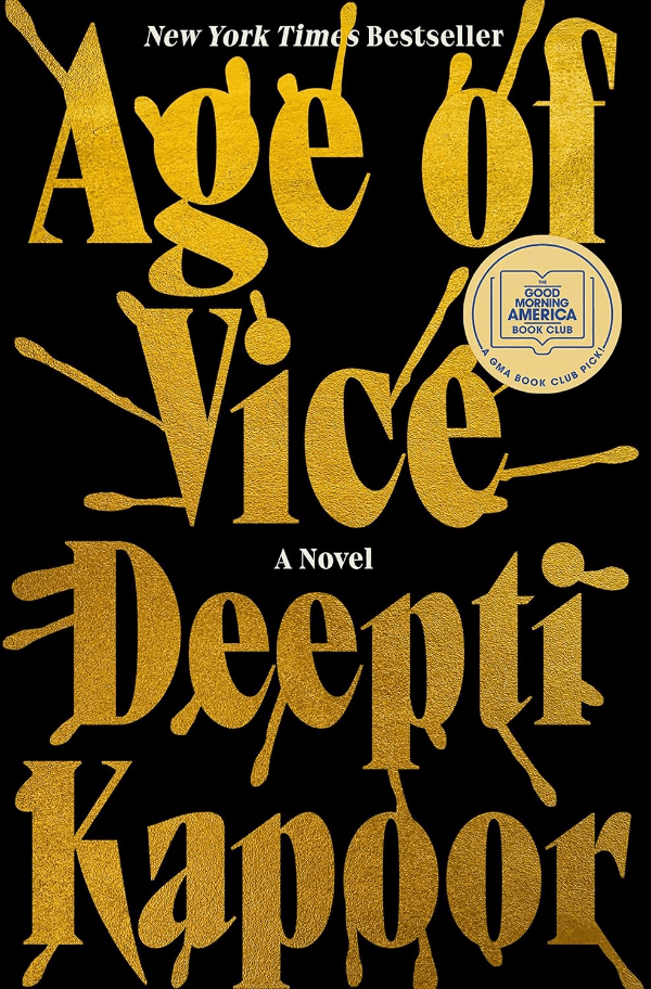
The Wager by David Grann uses a weighty serif font, matching its intense themes, while Age of Vice by Deepti Kapoor’s textured serif hints at a complex, layered story. Both covers use bold serif fonts to command attention and promise engaging content.

If you’re considering a serif font for your book cover, think about what the style of the letters says about your book. Is it formal? Traditional? Choose a font that matches the message you want to convey. The right font not only draws readers in but also tells them what kind of book they’re picking up.
Minimalist Typography
Minimalist typography is about keeping things simple and clean. This style uses basic fonts without extra details and usually has a lot of white space on the cover. It’s great for making a book look modern and easy to read. This trend works well for many kinds of books, from novels to non-fiction, because it appeals to a wide range of readers.
For instance, Poverty, by America by Matthew Desmond and Yellowface by R.F. Kuang are good examples of this trend. Their covers have straightforward fonts and lots of space, which draws attention to the book titles and authors.


Link to the rest at The Book Designer
PG admits to playing with fonts and using them in a variety ways on some of his non-TPV projects, but he can’t get as intellectual as the author of the OP does about font selection.
He liked all of the covers discussed in the OP (there are a lot more interesting examples at the OP), but he doesn’t look at the covers and think, “That’s modern and clean. It fits perfectly with the contents of the book.”
In PG’s modern and clean opinion, the job of the cover is to catch the eye of the potential purchaser, to stop them scrolling through Amazon or, less likely, walking down the aisle of a bookstore.
He admits that some visual styles might not work with certain types of books.
For example,

doesn’t suggest a Civil War History to PG.
Nor does

communicate the the contents of the book talks about the Uniform Commercial Code. (That said, in a law school bookstore – physical or online – a lawbook cover like the above would certainly stand out.)
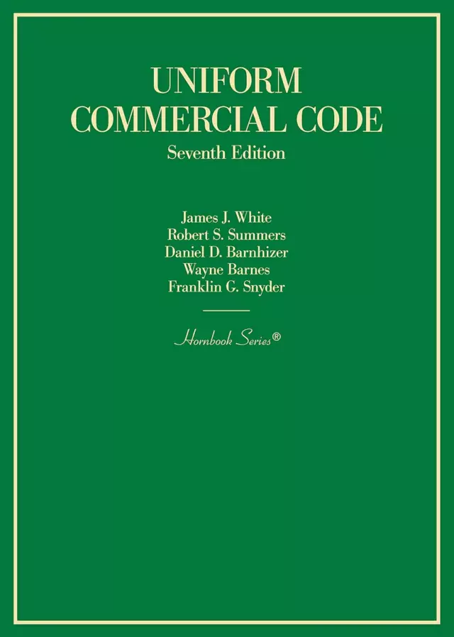
Leaving aside for the moment that the copy of White & Summers on the bookshelf across the room here at the Shark’s Nest is the Third Edition, and has no coverage of Article 2A or Article 2B because they didn’t exist yet…
The OP neglects anything other than a “these are things I noticed” level. It doesn’t go into why. It doesn’t acknowledge that even NYC-based cover designers are now designing covers that will be clear and distinct at 330px x 500px, the size that the Yellowface cover appears at (default) on the ‘zon’s individual book page. Or in BiblioCommons (the most-common public-library electronic catalog platform) on the individual book page.