From The Outline:
The age of font minimalism is coming to a close.
. . . .
A few months ago, I found myself oddly transfixed by an advertisement on the train for a mattress company called Allswell. At first, I couldn’t tell what made the ads stand out from the dozens plastered across the trains and platforms at any given time. After several train rides spent staring up at the unnaturally bright smiles of models happily perched on mattresses, I realized: it wasn’t the ads themselves that stood out to me, but rather, their typography.
The Allswell logo uses Caslon Graphique, a striking, elegant font that lends an air of luxury and sophistication to a relatively young brand. Caslon Graphique belongs to a category of fonts known as Didones. Didones are serif fonts, meaning that, unlike the font that you’re currently reading, the strokes of letters have little feet at the ends. A Didone is characterized by long, narrow serifs, as well as a strong contrast between thick and thin strokes (see the difference in the curve and the crossbar of the ‘e’ in Allswell). Together, these elements give a Didone font a certain, unmistakably refined quality that is often absent from sans serifs or even more traditional serifs such as Times New Roman.
. . . .
Didones first came into fashion around the turn of the nineteenth century, when printers and type designers began experimenting with alterations to the more traditional serif fonts that had defined newsprint and advertisements throughout the 1700s. Firmin Didot of France and Giambattista Bodoni of Italy were the founding fathers of the style, which was then called “Modern.” “Didone,” coined long after their deaths, is a portmanteau of “Didot” and “Bodoni,” which are also the names of two long-enduring Didones still used today.
. . . .
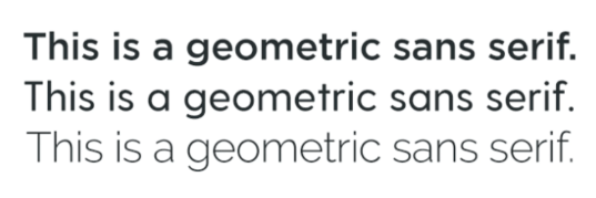
In order to comprehend the significance of the budding Didone empire, one must understand what has happened to typography in the past ten years or so. At the beginning of the 2010s, geometric sans serifs — those without serifs or contrast in stroke width, and whose letters are built around simple shapes like circles and squares — experienced a dramatic uptick in popularity within web and digital design. As the geometric sans serifs rose to prominence, elements such as drop shadows, gradients, background textures, and bevels began to fall away, leaving behind the flat, minimalist digital aesthetic you might see on Facebook, Airbnb, or Postmates. Many designers cited a desire for increased legibility on low-resolution screens as reason for the shift; the desire for increased page-load speeds likely also played a role.
By 2015, when Google and Facebook pivoted to geometric sans serif logos within a few months of each other, geometric sans serif typography and minimalist aesthetics had reached a saturation point, both online and off. Among Peak Minimalism’s alleged merits were its implication of transparency: the spareness of brands stripped of clutter and ornament felt trustworthy, as if excesses in style were a middleman between consumer and company that had been stripped away. In the later half of the 2010s, however, oversaturation led geometric sans serifs to grow somewhat stale. The same attributes that once signalled approachability and friendliness began to read as sterile and impersonal as they grew more and more ubiquitous, particularly among large corporations and tech companies.
Didones represent a complete about-face from the design ethos of Peak Minimalism. On a technical level, Didones and geometric sans serifs are more or less total opposites: serif versus sans serif, intense stroke contrast versus none at all, tall ascenders (letters like “h” and “t”) versus short ones. But there’s also a more extensive rejection of the 2010s aesthetic at play. Against the no-frills, cheerfully pared-down look of Google et al, the use of Didones in the context of marketing feels downright luxurious, whether that sense of luxury is applied to a mattress or a vibrator or even a first aid kit. It’s worth noting that in addition to the clear generational dynamics at play — the majority of these brands appear to be marketing towards young people primarily — the new Didones seem to appear most often alongside brands that market towards women, be it Dame, Modcloth (a women’s clothing retailer), Flesh (a shade-inclusive makeup brand), or Kirsten Gillibrand’s brief presidential bid.
Link to the rest at The Outline

