
From Fast Company:
Charlotte Strick was on a high.

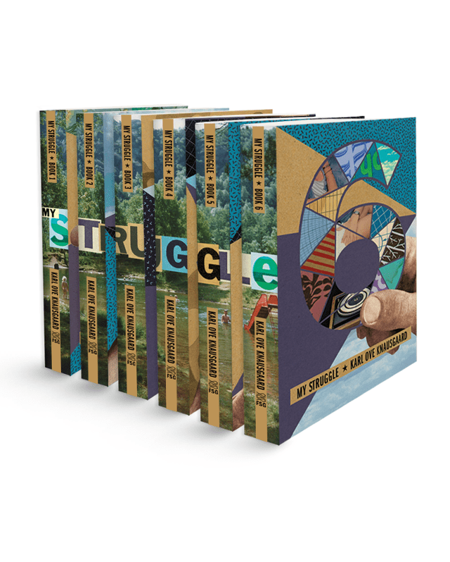
She’d been tasked with designing the book covers for the English translations of Karl Ove Knausgaard’s six-part autobiographical novel, My Struggle—and she’d landed on a concept to tie the volumes together. Perhaps surprisingly, everyone else had, too. The collaged, Easter egg–laden set was an immediate hit in cover meetings at Farrar, Straus and Giroux, and the first book had hit shelves, but then Strick says a literary agent intervened. The books looked too artsy, and he wanted something more straightforward to reach the masses. So with only one installment on the market, the line got scrapped for a more traditional look—author photo with big, clean type, and a solid blurb.
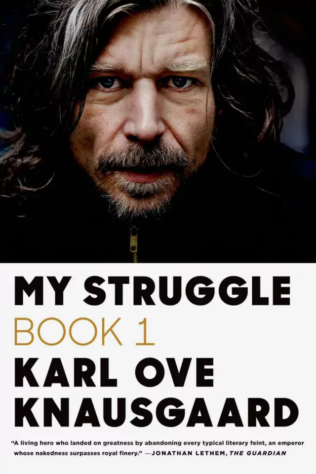
“There’s nothing scarier than [someone saying], ‘this book is not going to sell with that cover,’” Strick says. “So any initial love kind of gets pushed aside.”
She was crushed (as are the people who still reach out to her to this day to ask where they can get the complete set). But the whole episode underscores a larger fact that I’ve come to believe after writing about book covers for years—killed covers are often where you can find the really great stuff. The surprising work. The refreshingly genre-breaking, exciting, unfiltered output that nudges the field toward its next evolution.
. . . .
Ultimately, when you see a book cover in a store or online, you’re really just seeing the tip of the iceberg. Because at most of the really big imprints, that cover probably went through the ringer.
Strick says that in general, the process begins with a designer receiving the manuscript and a jacket brief outlining the mandatory elements (e.g., title, author name, maybe a blurb), and comparison titles for reference. The timeline is usually tight, and when it comes down to it, the creative stakes are high: You’re essentially tasked with creating a single image to brand thousands of words that could have been years in the making.
“It’s tough, because to the author, it’s their baby,” Strick says. “And in some cases, they’ve been working on this for a decade. And you have two weeks to come up with an idea.”
From there, designers create comps, or a series of proposed designs for the team to weigh. The reasons why some comps meet untimely ends are many, from an editor or marketing lead’s personal preferences to genre conventions to performance metrics of similar approaches to the author’s best friend’s opinion or, maybe, the sheer fact that an exec has a cold that day. Of course, this isn’t to say that what hits the market is bad—in fact, I’d contend we’re in a golden age of book cover design, with each publishing season bringing a deluge of insanely great jackets. But at the end of the day, a lot of fantastic and fascinating work hits the cutting room floor.
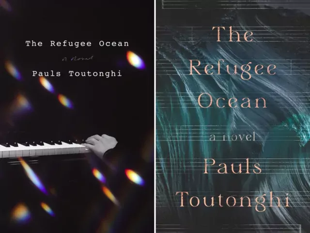
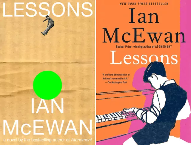
So as “Best Book Covers of the Year” lists pop off this month, let’s celebrate the work that didn’t win the day. Here are some of the best book covers of 2023 that you did not see—with insight directly from the designers who created them. The version that ended up being scrapped is on left, the final version is on the right.

Link to the rest at Fast Company
PG is somewhat conflicted in his response to the OP.
1. The principal purpose of a book cover is to sell the book. Regardless of how many plaudits the cover artist receives from the designing community for a cover, if the cover doesn’t sell the book, it’s failed in its principal purpose.
2. Typical publishing executives, English majors all, are almost certainly not experts on the design of marketing and promotional pieces. PG doubts that there is a “golden gut”, someone who is brilliant at selecting an image out of many possibilities that will sell a million books, that will stop someone browsing through Amazon books from just clicking past a book instantly.
3. In one of his ancient past lives, before personal computers and computerized design tools, PG worked for a large advertising agency.
While developing an ad campaign for a new product, a lot of smart people, usually including at least one person with a “golden gut” and a long track record of successful new product launches (and often more than one), looked at multiple mock-ups of print advertisements, television commercials, etc., before sending the creatives back to the drawing board for a new iteration of mock-ups based on the feedback from the first ads showing.
It was not unusual for a campaign to go through several more such meetings before a preliminary approval was agreed upon. Then, a series of more polished mockups based on the selected theme were created. Preliminary television commercials might be created.
The winners of the earlier rounds were then presented to groups of consumers that constituted the target market for the product to learn which messaging approach gained the most positive response and what the consumers thought about the product after seeing the various messaging. It was not unusual to go through this exercise with several groups of consumers.
At this point, a presentation was made to the client that was launching the new product, summarizing the research process results and the consumers’ reactions. Sometimes, proposed mocked-up versions of print, television, etc., based on consumer research, were shown to the client.
End of past lives.
PG’s disquisition concerning how serious marketing decisions involving millions of dollars were made was to contrast how unsophisticated the development and adoption of cover design at a typical traditional publisher, as depicted in the OP, is. Professionals do things much differently than publishing executives do.
Methinks PG is submitting himself for an Understatement of the Year Award…
Having been forced to sit in a fair number of cover meetings in my time, may I just say that they bear no resemblance whatsoever to PG’s description of a campaign-development meeting? For example, because cover designers are more often than not not at cover meetings, the game of telephone gets played on providing them feedback for what needs to be changed — and worse, they have no opportunity to ask further questions. Then, too, a majority of those attending a cover-design meeting know nothing about the books; at most they’ve been provided with a short precis, but whether they’ve read it is another question entirely.
We won’t get started on massaging the ego of the Art Director, either. Especially Art Directors who think that “branding” for books is far more about the publisher (or imprint) than the author… and will rechannel all discussion in cover meetings, even when told by subject-matter experts that their design preferences are inappropriate for a particular book due to its subject and/or required market (such as “Elementary and middle school in racially diverse, urban public school systems,” which just doesn’t work when all of the proposed covers per the Art Director depict white kids in the wrong age groups and in suburban/rural clothing and settings). One suspects that kind of nonsense wouldn’t last long at an ad agency.
To be fair, PG, that kind of investment in marketing research that you describe is for products where the anticipated return is much higher than the typical book.
Very true. A version of the same process is used by “real” businesses in designing their primary website, but that would bankrupt indies. So, small businesses built/run by retired executives can only afford to rely on gut choices and happenstance experience.