From Jane Friedman:
This story starts about eight years ago, with the arrival of a much anticipated email from the publishing house where the first edition of my book, Good Naked: How to Write More, Write Better, and Be Happier, was in production. Wrote the marketing coordinator:
Dear Joni,
Attached is the final version of the cover design for Good Naked, which the designer has asked me to pass along to you. Please note that the white gridlines are watermarks that won’t be present in the finished product…
Even now, years later, I get aftershocks thinking about the first time I opened the attachment and saw that cover design. There, filling my screen, was the image of a naked woman’s body, full-frontal, lingering in the shadows against a smoky backdrop. She was cut off from the neck up and knees down. Against the dark backdrop, two pink circles (representing the Os in the book’s title) drew the eye to the woman’s breasts. Her slender fingers formed a V, framing her pubis. And just below her private parts, spread across her silken thighs, was my book’s subtitle—How to Write More, Write Better, and Be Happier.
In summary, the proposed cover for my book—a cheerful and practical writing guide based on my decades of experience as an author and teacher—depicted a nude, headless woman, beckoning book browsers from the shadows like a back-alley sex worker.
Here, I feel compelled to state that I have nothing against back-alley sex workers. I also will concede that, yes, my writing guide has the word “naked” in its title, but so do a lot of other books, like Naked Statistics, which has a pie chart on its cover. So, when the designer saw the title of my manuscript, what made him think of soft porn? Why did he design a cover better suited to an entirely different type of book, say Fifty Shades of Writing?
I reread the email to make sure I had not misunderstood.
Final version of the cover…Please note that the white gridlines…
Could the marketing coordinator who had written this email to me be any more misguided? How could she think that a few barely perceptible gridlines on the enclosed image would be my primary concern, when there was my name—Joni B. Cole—attached to a work suggesting much more for sale than writing advice?
This story comes to mind as I think about feedback during the publishing process. In this situation, I, the author, was the one tasked with providing feedback, despite being told the cover design was “final” and despite my fear of consequences. I worried that my book was already on a tight production schedule. Could the designer refuse to make changes? If I refused his refusal, could the publisher delay my book’s release, or even pull it from their list? Would I end up blacklisted from the industry, a note on my file listing me as unpleasant, uncooperative, and unwilling to do nudity?
All sorts of worries, real and irrational, cluttered my thinking. But, given the situation, I felt like I had no choice but to reject this cover wholesale. I imagined my new release displayed in the creative-writing section of my daughter’s college bookstore. (And she thought I had embarrassed her in the past!) For moral support, I showed the cover to a few friends, seeking their reactions:
“Is this a joke?”
“Whoa! I thought maybe you’d been exaggerating.”
“Is it me, or is that woman about to get busy with herself?”
The only positive comment about the cover came from my friend Dan. “It’s not that bad,” he shrugged. “Maybe it will sell some books.”
Yeah, right, I thought, and maybe people will assume those are my silken thighs. But that doesn’t make it right.
My friend Dan did make a valid point. Helping a book sell is indeed one of the main considerations when designing its cover. Depending on your publishing contract, you may not have much, or any, say in the final design, and that isn’t completely unreasonable.
. . . .
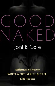
In case you are curious about what happened to that naked woman on the “final” cover of my writing guide, here is the rest of the story. As soon as I saw that image, I called my editor in a state of high dudgeon. As it turns out, he shared my low opinion of the cover choice, but the designer had voted him down. “Don’t sweat it for now,” my editor told me. “Marketing is on your side as well.” This begged the question: Who was this designer with such sway he could override both my editor and the folks in marketing?
Weeks passed. My print date drew near. Each time I checked in on my sex worker, I was told that the designer remained reluctant to remove her from my cover. As a seasoned author, I am not afraid to speak my mind, but I am also not big on ultimatums. “Replace that cover—or me and my book are walking!” For me, it still feels like a miracle when a publisher accepts my work. It was unfathomable to think I would do anything to jeopardize my “forthcoming release,” two words I love dropping into every conversation. But I just couldn’t accept that cover. This felt bigger than a battle over design. This had the stink of misogyny.
Finally, I got word. Fifty Shades of Writing was no more—I would see a new cover option for Good Naked by the end of the day. This news came in the form of an email from the same marketing coordinator who, weeks earlier, had sent along the original design
Link to the rest at Jane Friedman