
From ReadWrite:
Color design can be an effective marketing tool if used correctly. Acting directly on the subconscious of the site visitor, the color in web design can form a positive attitude to the product, trust, and positive emotions that cause a person to make a purchase and believe your brand.
When a person first enters the site, he intuitively perceives the picture as a whole. Within the next 1-2 seconds, the client decides to stay and explore the resource or to close the tab and go back to the search results. If the color design of the online business is chosen and implemented correctly, the user will more likely remain on the page.
. . . .
The principles of color combinations originate from Newton’s color ring. Of the three primary colors, intermediary ones are produced by mixing, which is located in the adjacent ring segments. To choose colors, use one of the following seven schemes:
Monochromatic – for design creation, one primary color is chosen, and additional colors are formed from its hues (saturation and brightness are adjusted).
Complementary – in this case, the color selection for the web site begins with the choice of two contrasting tones, which are complemented by several more derived shades.
Split – this scheme is similar to the complementary one, but one of the contrasting colors is replaced by two similar ones from the adjacent segments.
Analog – according to this scheme, 3 colors are chosen from the neighboring segments: one is used as the main one, and the other two play the role of additional accents.
Triad – the designer takes three colors that are equally distant from each other, and on the basis of them forms a color palette.
Rectangle – here, four colors are used, and each pair is chosen according to the principle of contrast.
Quadrate – the scheme resembles the previous one, but all colors are equally distant from each other.. . . .
In developing the color scheme of the site you should not be guided solely by your own preferences. After all, the site is created, first of all, for the user. How to choose the right color for a site is a question of understanding the psychological aspect of the influence of colors and using this knowledge in accordance to your goals. There are three methods for choosing the color of the site which we will discuss in detail below.
. . . .
Colors for website design should correspond to its theme or product/services to which it is dedicated. For example, purple is the traditionally chosen shade for perfume sites, a site about auto lease deals is difficult to imagine without the use of dark blue or gray colors in the design.
. . . .
The site, designed with a large variety of colors, is hard and even repulsive: getting to it, the user wants to quickly close this tab. If there are few colors, the site may look monotonous, and the user’s attention will be dispersed. The optimal working palette for the designer is 3-4 colors:
Main. The basic color in the design, which highlights the main content on the pages.
Additional. Color to highlight background information, which is advantageously combined with the main color, complementing it.
Background. Calm shade on which the main and additional colors are not lost.
Accentuating. Contrast primary color that attracts the visitor’s attention to key elements of the site.
. . . .
Color perception is not constant. How a person responds to the same color depends on many factors. But still, before choosing a color for a site, you need to examine the typical associations for each color that are specific for most people.
Link to the rest at ReadWrite
PG says authors should be color conscious in all of an author’s marketing activities.
These will include:
- Website
- Book Covers
- Individual Books
- Series
- Email Newsletters/Announcements
- Online and Meatspace Advertising
- Online Product Listings – Amazon, Nook, etc.
Here are some tools that might help with your color choices:
- Colorpick Eyedropper – Have you ever been online and found an image, website, etc., etc., that includes colors you absolutely love? Here’s an app that lets you determine exactly what colors are being used and provides the necessary color codes to let you reproduce those colors in your own marketing. https://go.shr.lc/2QNwQEp
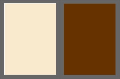
On the left below is the color of the font PG uses for The Passive Voice title at the top of the blog and also the background of the post section. Its hex color code is #f9eacc. If you put that color code into your browser, you’ll see the same color. On the right is the brown color PG uses for the headlines of each blog post – #723419
- Palette Creator is another Chrome app that will pull all the colors out of a photo and save them. https://go.shr.lc/2WKFYPn
Here’s an example of Palette Creator in action:
Here’s a photo:
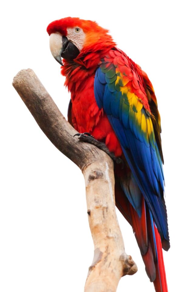
Here’s the 16-color palette that Palette Creator pulled from the photo:
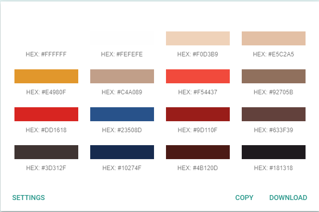
You can use some or all of the palette colors to create a Macaw-like image.
- If you’re worried about correctly identifying what colors go with other colors, there are several online color palette creators. Here’s Coolors – https://go.shr.lc/2QPD4U2
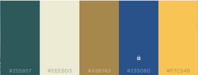
PG will pull the dark blue color – #23508D – from the Macaw palette above and use it as the base color of a complete palette. Here’s what Coolors came up with. The original dark blue is the color strip with the lock symbol on it:
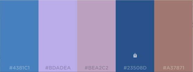
Don’t like this one? Hit the spacebar while Cooler is running and see a different palette based on the dark blue.
- Paletton is the most complex and sophisticated palette creator PG uses on a regular basis. https://go.shr.lc/2QLmmW7
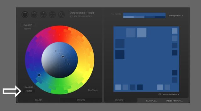
Below is the opening screen – PG has dropped the same dark blue color code into the website – 23508D as a base color for Paletton. You can barely see it at the tip of the white arrow.
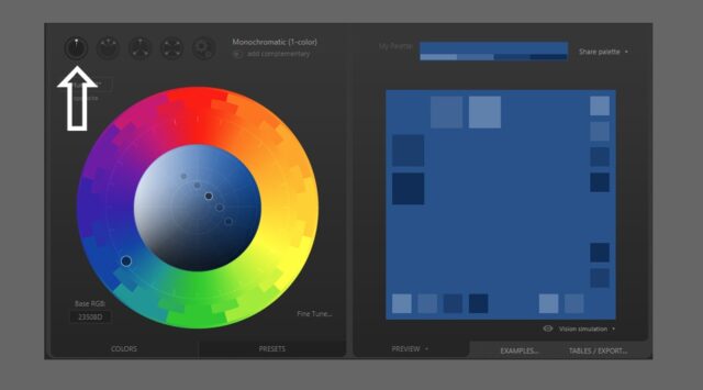
Below, you can see the upward arrow pointing to the Monochromatic palette. On the right side of the screen you see a variety of colors that are complementary to the original dark blue color we’ve been working with.
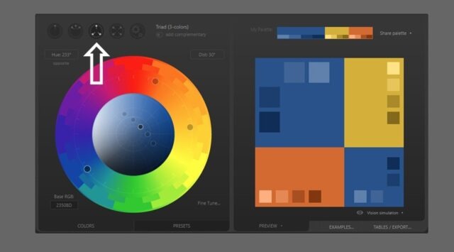
The white arrow below is now pointing toward the Triad setting. You can see the results on the right side of the screen. You can also see three little gray dots on the color wheel over the original blue plus an old gold and a light umber color added to make up the Triad.
Adobe also has a palette design page at https://color.adobe.com/create. It’s easy to use, somewhat like Coolors. If you have a subscription to Creative Cloud, Adobe’s pallet design can be easily imported into other paid Adobe products for use there.
I’m a big fan of Coolors, too.
When I rebuilt my author website, I commissioned a new header image ( https://hollowlands.com/platform-header1i-jpg-and-palette/ ) and built a palette to match it for all branding, including author clothing at events ( https://hollowlands.com/20170605-palette-final-with-collateral/ ).
For publishing purposes, check here at Print Ninja
They’re indie-friendly and help authors with Kickstarters. But the main point is their color-mixing guide. I stumbled on to the company because of their explanation for how to properly convert RGB to CMYK. If you’re using Photoshop, they don’t recommend just going to the menu and switching the color mode.
I think PG linked to Canva before. I found their list of website color schemes helpful, too. I used to see a similar scheme to number 7 at the link used a lot in book covers (the blue and red specifically).
Thanks for the additional references. I am definitely graphically challenged.
Several years ago when trying to figure out what my website should look like, I discovered https://www.colourlovers.com/palettes
More examples of color in film to tell a story:
https://www.studiobinder.com/blog/how-to-use-color-in-film-50-examples-of-movie-color-palettes/
The link has a download for a free e-book if you’re really into this. Color is definitely a not-to-be neglected tool for the visual storytelling media. And book covers, too. I remember fans noticing the blue-shift / red-shift from the Normandy moving faster than light in the Mass Effect games. If you have a sci-fi cover, you’d consider such lighting effects for your spaceship.
I highly recommend two books:
“If It’s Purple, Someone’s Gonna Die: The Power of Color in Visual Storytelling” by Patti Bellantoni
and
“Type & Layout: How Typography and Design Can Get Your Message Across-Or Get in the Way” by Colin Wheildon
(he has charts showing how certain colors make reading almost impossible)
That first book has a cool title. I took a few film classes, but I don’t remember learning about the purple factor. A couple of years ago I’d read that filmmakers had an obsession with putting orange and teal together. Purple = foreshadowing of death? That piques my interest.
Speaking of colors, has anyone here taken X-Rite’s Color IQ Test? ***Mr. PG?
https://xritephoto.com/cool-tools
I scored high the first time I tried it. Then subsequently got worse and worse on retries. Brain fatigue?
It’s fun. Try it. (and like they suggest, having a calibrated and profiled monitor helps)
CORRECTION: I scored low — “0” is a perfect score. I think I got an 8 as my best. Try to better that.
P.S. and here’s a skinny version of the same online test:
https://www.xrite.com/hue-test
You should be able to get a “0” on this one. I just did.
I haven’t, but I will, Harald.
Thanks PG!
You’re welcome, Mit.