
Mrs. PG has gone back to address some minor typos and a few other corrections in some of the earliest ebooks she published, beginning about eight years ago. Formatting the corrected ebooks has been a trip down memory lane for PG.
As previously discussed on TPV, PG has used Kindle Create to format the books Mrs. PG has published since KC’s first availability. He has found that Kindle Create is very easy to use and produces a nicely-formatted fiction ebook. Until something better arrives, that’s what he’s using for Mrs. PG’s books in the foreseeable future.
In connection with the above-mentioned republication, PG has pulled up the original ebook files which were published with Jutoh. In the process, PG has been reminded about what a powerful and elegant formatting program Jutoh was and is.
Eight years ago, PG was strongly affected by print book formatting (he had formatted POD versions of Mrs. PG’s books) and he brought formatted files and practices into Jutoh for preparation of her ebooks at that time.
Revisiting those early ebooks, PG found drop-caps, page-appearance related formats, etc., etc. He also found he had included some erroneous code in those ebooks that made a few parts of the books look a little off upon PG’s latest inspection.
One example of this was PG’s use of drop-caps at the beginning of chapters and in the body of chapters where there was a major change in scene, etc.
Drop caps have been used in books for hundreds of years for a wide variety of reasons. Here’s an example from 1407, before the invention of the European printing press.

Historically, they marked chapter breaks, with other visual cues denoting the beginning of another long sentence, etc. They were visual cues to permit the navigation of large and heavy volumes. PG seems to remember that some of the earliest bibles did not include anything like a table of contents.
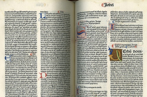
The printing press resulted in the production of many more books, but drop caps continued. In the following printed bible c. 1480, the printer left space the creation of colored drop caps after the book was printed.
(For more on drop caps throughout history, see this Smashing Magazine article)
Back to PG’s formatting.
He realized that he doesn’t remember seeing many drop caps in the ebooks he’s read recently (although he may have simply overlooked them).
For further insight into current ebook formatting best practices, PG found a blog post by JW Manus, a long-time visitor to TPV, who does custom book formatting for indie authors. Here’s part of what she says in a post titled, Why Your Ebook SHOULD NOT Look Like a Print Book:
I’ve been noticing a disturbing trend of late: Writer/publishers who want their ebooks to look (and act) like print books–and print designers turned formatters who encourage it.
What those who try to force print design into ebooks seem unaware of is WHY readers like ebooks:
- Portability. (I can carry hundreds or thousands of books in my purse.)
- Availability. If a book is in digital form and offered for sale, then it is always in stock. If you finish a really terrific book and want to read another of the author’s books, just pop over to the retail site, buy the next ebook and keep reading.
- Reader-friendliness. If, like me, you have overworked and/or aged eyes, the ability to increase font size and line height is a godsend. If, like me, you enjoy reading outdoors, an eink reader completely eliminates page glare and the resulting eye fatigue. If, like me, you like to read in bed but your partner wants you to turn off the damned light, if you have a tablet or backlit eink reader or smart phone, you can turn off the damned light and keep reading.
- Social reading. For those who like being part of a club, you can connect your books to other readers and share highlighted passages and comments.
- Price. Unless the ebook is coming from one of the Big5 publishers, it’s probably inexpensive enough to appeal to even the heaviest readers. They are inexpensive to produce, cost nothing to stock and free/cheap to ship. They should be inexpensive. I bet I’m not the only reader who was priced out of the print market and stopped buying new books, but because of ebooks is now back to buying four or five new books a week.
. . . .
Publishers and formatters drop the ball for one of two reasons:
- They don’t understand how ebook reading devices work.
- Their priorities are skewed.
If you don’t know how reading devices work, you have no business formatting an ebook. Period. It’s not easy keeping up with everything. Trust me, I spend a lot of time keeping up with updates and changing devices and standards. I have four Kindles, an iPhone, and two computers on which I read and/or test ebooks. I use several programs to test out new techniques. My goal with every job is to produce an ebook that can be read on any device. If you don’t know how ereading devices work, you can format an absolutely stunning looking file in Word or InDesign or Scrivener only to have it completely fall apart or turn into an unreadable mess when it’s loaded onto an ereader. If you’re using Calibre to convert commercial ebooks, chances are you’re unaware as to why that’s a bad idea. The truly clueless seem to be the most proud of creating one-size-fits-all formats for print, epub, and mobi.
. . . .
Drop-caps. They’re pretty, I get it. Unless you are a pro and willing to te st your coding across a multitude of devices, delegate drop-caps to the print version. And don’t forget to test in landscape mode. The results can be… disconcerting.
. . . .
Text-wrapping around images. This is another element that can seriously bite you in the butt. It can work, but only if you know exactly what you are doing (and just because you can do it in Word or InDesign doesn’t mean you know how to do it in an ebook). Consider the many, many, many readers who use their smart phones as ereaders. What happens on an iPhone as it struggles to fit everything on the screen would be laughable if it weren’t so annoying to the reader. It can be pretty nasty when readers need a larger font size, too.
Link to the rest at JW Manus
In Jaye’s post, she includes a page capture of an ebook in which the drop cap looks fine in a Kindle Fire, but not in a Kindle Paperwhite.
So, PG removed the drop caps in the old ebook file when formatting the new one.
Hot tip: no matter how important your art or media teacher thought “white space” was, hardcoded one inch margins on each side of a PDF page on a handheld device is generally not appreciated by the end vic… er, user.
Further, fonts that might look great on someone’s 42″ 4K desktop don’t necessarily look good on a 7″ tablet or a 5″ phone. Often, they’re like trying to read chicken tracks through a screen door.
Ebooks don’t do well with Drop Caps. Period. However, Raised Caps generally work quite nicely, and achieve much the same effect. You can use a larger relative font size for the first letter of a new chapter. Or, sometimes, an image made from a fancy font (you don’t want to embed fonts).
I’m not a book designer by any means, but I have been involved on the development side with many word processing and publishing applications. I even worked with folks building an eReader in the 80s. This stuff can get extremely complicated, but it has been getting easier. Always remember that a good paper design is not necessarily good digital design.
I’ve said it before here, but I’ll repeat it. Use styles. One of the great innovations of the last 30 years has been separating the notion of a style from its physical appearance.
A “Bold” style can be expressed in many different physical ways: a change in color, font, font style, font size all can be used effectively in some contexts. As an author, identify the style you want and then decide later how the style should be expressed. That gives you, or your book designer, the freedom to express “Bold” in the way most suited to the publishing medium.
Practically, using Msft Word as an example, never use the home ribbon font section to change anything. Always choose the appropriate style to indicate that you want a certain level of emphasis to a sequence of characters.
I’ve never gotten into drop caps, so I may be mashing the details, but I would add a “Drop Cap” style to my word processor if I wanted to use them. For a given eReader, your book designer, or you wearing your book design hat, can decide how a dropped cap should look in that eReader. Treating a dropped cap as an ordinary character could be best for some displays. Treating dropped cap as a style makes that easy.
Meticulously using styles rather than changing the physical appearance will make your book design life much easier.
Drop caps, changes in font, bolding, etc. all date from formatting for navigation upon a printed page. All are best avoided in e-books, because in an e-book, the principle really should be: Give Control To The Reader. The reader will choose the virtual page size, the reader will select the font, the reader will select the font size, the reader will select either discrete pages with a turn or continuous scrolling, the reader will select background page color and lighting, the reader will select the device. The reader will highlight, bookmark, and annotate which is adding their own navigation aids. Goodbye to headers, footers, footnotes, and page numbers.
This.
KISS because anything that tears me out of being lost in the story reduces how much I’ll like the story. Even in print I’ve seen the overly fancy drop letters and had to figure what the heck it was supposed to be – then try to get back into the story. Indent and/or a bit of extra line space, no to drop letters.
Totally agree, though not all those choices are given to readers by current e-reader devices and apps. However, the ones that matter to me are all there. As to formatting errors, one of the worst cases I own – from Random House, not some indie – has the footnotes inserted within the main text, presumably as and where they originally appeared in the printed book, and so often appearing in the middle of the e-book page. Really unprofessional. As you say footnotes have no place in e-books (though I much prefer footnotes to endnotes in paper books, I love hyperlinked endnotes in my e-books).
Another major problem is including special text as an image so it does not scale with font size. The book I’m reading now represents text exchanges this way – and I’m sure it would work fine on the printed page – but anyone with eye problems will not be able to read them. It also threw me out of the book as I found myself thinking how to use Word styles to give the effect the author desires.
Mike,
I format a lot of non-fiction (and for non-fic I do NOT recommend using Word or other word processors). Depending on the project, I’ll handle footnotes in various ways: In-line with the text (popular with translators attempting to explain an untranslatable word or passage); at the end of the chapter or section with links going back and forth from the note to the text (Kindles and Fire tablets will “pop-up” footnotes created this way–pretty cool); at the end of the book, in its own section, again with links back and forth. I don’t use superscript characters to note the entries, either. They are too easy to miss on a screen. I use a number in brackets, full size. Not as pretty as superscript numbers, but much easier to read (and link to).
I don’t recommend using Word if a book has images. Inserting an author pic isn’t going to do any harm, but within the body of the book there will be problems. Either of scale, or because the image is fixed in such a way that it interferes with reader preference controls. A highly effective free source is Sigil. It has all the tools a publisher needs and it’s not that difficult to learn.
A word about styles in Word: paragraph styles are the key to creating a professional ebook. But character styles that change a font size can cause conflicts. Conversion programs recognize Normal and Heading styles and will designate those fonts as “Regular”, making those styles scalable in user controls. If you change a font size from, say, 12pt to 9pt, the conversion program can lock that 9pt font. If the reader needs a larger font size on the screen, that 9pt word can appear teeny-tiny or even unreadable.
Ebooks are HTML, the “language” of the Web. You can set up a footnote as an internal link, with an anchor to send the reader to the right entry. Just include a link so they can get back. Absolutely no reason not to have footnotes if your work needs them. This isn’t even hard.
I’m not sure but I suspect that we are only disagreeing about semantics, specifically the meaning of footnote, rather than something more substantive.
To me footnote is something left over from print formatting where the note appears at the bottom of the printed page holding the text to which it refers (rather than at the end of the chapter or of the book). This is very common in my older history books, for example, but has largely vanished from more recent ones (and I’ve always supposed that this change was because it made typesetting easier though accessing the notes was then harder for readers).
I’ve never seen an actual attempt to display footnotes – in this meaning – in e-books and very much doubt it would be worth the effort, though I have seen fudged attempts which probably resulted from the unintelligent use of OCR to digitise the print book. Internal links of the kind to which I think you refer of course work very well (and I tend to call them endnotes simply because this terminology is used in Word and this is what I’ve used when creating documents containing linked notes).
Fair enough, Mike. I think that when you translate a print book into an ebook, you have to consider both the purpose of the feature and what the user is supposed to clean from it. In print, a footnote provides additional content or context, which may be read, or not, at the reader’s option.
In an ebook, having a footnote appear at the bottom of a screen seems both pointless and exceedingly difficult to do. But the link, with link back, seems to accomplish the intent of the feature quite well – I.e., additional content optionally available to the user.
So, I agree, internal links work really well for this.
Hey, PG, thanks for the shout out to my blog. I agree with you about Kindle Create. I don’t use it for the ebooks I create, but I’ve horsed around with it. Other than the program encouraging the use of drop caps, it’s easy to use and creates good results.
The really good news is that ebook formatting has become ever so much easier because the conversion processes used by the retail and distribution sites have become so much better. Using Word for formatting is no longer a landmine-filled process, and publishers don’t need to use third-party conversion to get good results. For just about any fiction project, a self-publisher can produce a professional ebook using Word (or Scrivener or other word processor). (I still wish people wouldn’t use InDesign. Just about every “broken” ebook I’ve purchased lately was converted from an InDesign file.)
My kid was reading the ebook from an indie who puts a lot of care into her paper copies, and apparently wanted the ebook to look the same. It was unreadable on any of our devices. Oh, you could see the words, but letter and line spacing was all wrong, lines were uneven. Example the letter O on one line, the rest of the word (once) two lines below and other words on the line in between.
It was awful. I reported it to Amazon as ‘formatting problems.’ and the ebook had vanished when I checked a few days later. I hope the author hired someone who knew how to format properly for ebooks after that. I don’t like her work particularly, so haven’t followed up.
To add another example: about 18 months ago I was reading a book on a Paperwhite where the dropped caps at the start of chapters caused a forced page break after the cap. It turned out that it worked fine with the azx3 version of the book file – the one you get when downloading to allow transfer by USB – but not with the later kfx file version.
Maybe this was a bug that’s since been cured, maybe something to do with the way the book implemented dropped caps but it seemed that they are best avoided. In fact, remembering some of the other problems I’ve seen, I’d suggest an author does better by going with the simpler the better.
Yep. That’s been my guiding principle all along. I figured that there are a bajillion different devices people are reading on, and the fancier the formatting, the more likely that it will not transfer well.
So I go for a clean, streamlined, professional look with no frills and furbelows.
I do love Jutoh, however. When I was uploading docx files directly to KDP, I sometimes got the weirdest glitches after the conversion, and had to jump through too many hoops to fix them. The mobi files that Jutoh generates never produce any of those problems. So I get my clean and streamlined files with a minimum of fuss.
And that should have been “azw3” not “azx3” files, but I was too busy correcting “kfx” which my tablet had decided to replace with “fix” that I didn’t notice my typo.
Having just spent a week, more or less, adding drop caps to mss in Scrivener (and learning more CSS than I’d hoped) I find that while the drop caps appear perfectly fine in the Kindle Previewer app for Mac, the Kindle app ignores them, along with most other ‘out of the way’ formatting.
I suppose I’ll have to rethink their inclusion. More testing, first, though.
Thanks for the update!
>> Drop caps have been used in books for hundreds of
>> years for a wide variety of reasons. Here’s an
>> example from 1407, before the invention of the
>> European printing press.
Wow, I thought PG must be a bit older than the rest of us, and hence the source of some wisdom, but I had NO idea that you were old enough to be formatting that far back. 😉
Poly