From The Book Designer:
In Brief: In book design we have to decide which style of pagination to choose: whether to keep widows and orphans or allow the bottoms of our pages to be slightly misaligned. This article presents both so you can make an informed choice.
People often seem to divide themselves neatly into two camps: shirts versus skins, innies versus outies, grow it out versus shave it off. And so it is in book design. There’s one decision every book designer has to make on most every book of prose they work on: squared-off pages versus no widow or orphan lines.
Okay, you need to know what “squared-off pages” and “widows” and “orphans” mean when talking about book pages, so let’s look at those first.
Editor’s note: After this article was posted I received an email from frequent commenter Michael N. Marcus, in which he said:
Years ago (maybe on my college newspaper) I learned that an orphan was the lonely entity at the bottom of a page, and the widow is at the top. To remember this, I visualize the “widow’s walk” at the TOP of old seaside homes.
I found this fascinating because when I learned this nomenclature long ago it was the exact opposite. It was the widow at the bottom of the page (always a full line) that had been “abandoned” and left behind, while the orphan (always a short line, since it’s the end of the paragraph) that had been left without the rest of its “relatives” and forlorn at the top of the page.
Wikipedia has this to say:
In typesetting, widows and orphans are words or short lines at the beginning or end of a paragraph, which are left dangling at the top or bottom of a column, separated from the rest of the paragraph. There is some disagreement about the definitions of widow and orphan; what one source calls a widow the other calls an orphan.
However, the Chicago Manual of Style prefers Michael’s usage, and readers should be aware of that.
Here are the basic concepts you should know about widows and orphans in book layouts:
Pity the Widows and Orphans
Text consists of letters built into words, which are strung into sentences sequenced into paragraphs. There are probably about 90 words in a typical paragraph. That means in a manuscript of 75,000 words you will be dealing with over 800 paragraphs and 5,000 line endings.
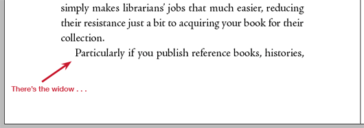
Because there are so many paragraphs, there’s a kind of random distribution that happens in books. If you get to the bottom of a page and there’s only room for one more line, and that line is the first line of a paragraph, you will have an odd look at the bottom of that page. This is a widow:
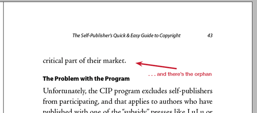
On other pages, just the last line of a paragraph may bump to a new page, leaving a stub of a line at the top. That’s an orphan:
Now some people hate these widows and orphans, and they will do anything to get rid of them. And since they don’t look very neat and tidy, you might think that’s a good idea.
But wait! There’s another entire group of people who, although they don’t like widows and orphans either, prefer them to the alternative.
What happens when you eliminate the widows and orphans? You lose your squared-up pages.
Let’s take a look.
To Square or Not to Square: That is the Question
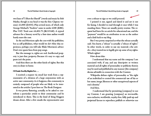
Here is a spread from a book. Notice that the widows and orphans have not been changed, and the right-hand page has an orphan line at the top.
You can change this globally throughout the book very easily. In Adobe InDesign we use the Keep dialog on the Paragraph menu. This allows us a lot of control over what you might call the infrastructure of the paragraph and how it behaves on the page:
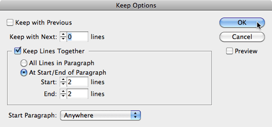
You can see here I’ve instructed InDesign to keep at least 2 lines together at the beginning and end of paragraphs. This will eliminate all widows and orphans. So why isn’t everyone happy?
Here’s the resulting spread:
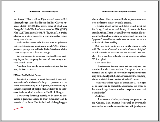
You’ll see that there is no longer an orphan line at the top of the right-hand page. But the line that moved there to keep the orphan company had to come from somewhere, and it left a space at the bottom of the left-hand page. We now have a different number of lines on these two pages, and they are no longer “squared off” at the bottom.
Link to the rest at The Book Designer
The last example on this page is just dumb. I saw how Brad Walrod handled this, and it seemed smart to me: just lop off that last line on the right-hand page, too. Walrod typeset the Harry Potter books starting with book 5, IIRC. In the hardcover of book 7, each page has 29 lines of text. To avoid widows/orphans, he simply made certain spreads have 28 lines. If Amazon still had the “Look inside” feature you could see him do this on pages 38 and 39 (which are facing each other). Those two pages have 28 lines each. Turn the page, and you once again have 29 lines each on pages 40 and 41, or pages 36 and 37.
This doesn’t have to be complicated.
I respectfully suggest that this is… 1990s technology and precepts, and the assumption that all text is pure text with no other elements. In no particular order:
• For those [insert criticism of intelligence here] persons using InDesign (or Word, or LibreOffice) to lay out an e-book directly from the text for a printed book, choosing the widows-and-orphans-protection function screws things up in the e-book. It usually hides, buried somewhere in stylesheets, the “display: block” CSS attribute… which never turns out well, frequently resulting in not two-line but five-line flow errors during reflowing (especially on a smartphone).
• It assumes that there are no block quotations, no lists, no epigraphs or verse, no footnotes, no tables, no charts, no graphs, no illustrative materials at all — just plain running text (with no italics or other non-roman characters, and that’s another issue: Squared-up pages look wrong if the last line on one page is partial and includes italics, no matter what the opposite page ends with).
• It assumes that the chapter-opening design correctly and uniformly makes that chapter-opening page have the same “bottom point” regardless of how long a chapter title, or epigraph, or any other non-running-text element may be. (And this is a problem with “Euro-normal” chapter openings, in which the page number of the first page of a chapter is centered at the bottom with no running head, as picks up immediately thereafter.)
• For forced-odd chapter openings, it just looks weird when there are two or three lines at the top of the preceding even page (end of the prior chapter). Those lines will not align with anything in the new chapter. And this is the CMS and 1990s-graphic-designer suggested default!
• Don’t even think about widow-and-orphan control in a “structured” document, especially if there are block quotations of numbered paragraphs or bulleted lists. I will happily eviscerate anyone who uses widow-and-orphan control — even manually — when quoting legal materials (let alone in legal materials) or when quoting military communications or scientific and technical materials. I’ll use a very, very dull spoon doing so.
I, for one, am sick to death of graphic designers pontificating on the proper layout of a book without regard to its content — and I say that having participated in designing both straight-narrative and highly complex STEM works. And that was in the bad old days of “it’s gonna be on paper or maybe this new-fangled PDF thingy only, so we don’t need to worry about anything else.”
Oh, I forgot to mention one other thing that necessarily changes everything about page-balancing:
• Drop caps and graphical section breaks (which never balance properly unless they are set at a round number of lines, which — again, especially with italics happening to line up opposite, or with a line with significant footnote/endnote references or even just a single relatively complex enumerated number or a string of them (“Henry’s force on the eve of battle consisted of between 1,100 and 1,450 men at arms, and most scholars now believe included between 4,200 and 6,300 archers”) — just looks weird). And I submit that a for-popular-audience-but-with-scholarly-support description of the 1415 campaign in France should be properly treated falling within “general design precepts” if those precepts are valid.